
The Anatomy of a Digital Writing Portfolio
Purpose: to prepare students for the wide and interesting range of rhetorical decisions they will be making as they compose and design their Digital Writing Portfolios.
Rhetorical context: writers, composers, and designers should be prepared to explain and to justify every textual and graphic element on the page — why that font? (what other resources/choices did you have)? why that font size? why that much/little white space? — why the picture of the Bean sculpture (what other resources/choices did you have)? why that background? why that link? why that color?
If you can follow that rigorous line of thinking through to its logical conclusion, it would suggest that even the slightest mark, or a bolded phrase, or a tulip, or a frog, or a hyperlink will require some kind of rhetorical justification; if the writer cannot provide one, maybe it shouldn’t be there?
This is not unlike how a good writer can do the same justification work with a finished essay: reader-based tone, arrangement, level of detail, types of support, etc.
Mini-Case Study: Kaelin D.: UCWbL Portfolio
Kaelin D. — Political Science & English/Creative Writing double major — recently composed a portfolio using the new version of Digication (2017). She has generously allowed us to use her Home Page as a mini-case study of her rhetorical decision-making process:
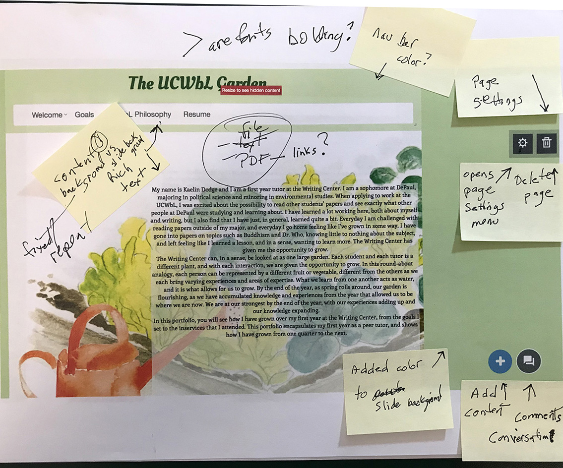
When I asked Kaelin about the floral theme — or metaphor — and why she made that choice, she explained that she wanted to create an ethos that matched her interests in, and her commitment to “nature” and gardening. That led to a discussion of the rhetorical effects of color — in this case, integrated with text via a background image (fixed vs. repeated; Kaelin’s is fixed). Kaelin’s rhetorically conscious choice integrates these modes — text, image, color — making good use of a “layered” effect.
In literacy-practice contexts, Kaelin may have benefitted from working on her high school newspaper, where she learned layout and typography.
We also discussed her rhetorically conscious choice of the Enriqueta typeface — “it looks like Georgia, which I like a lot” — and its readability on a screen.
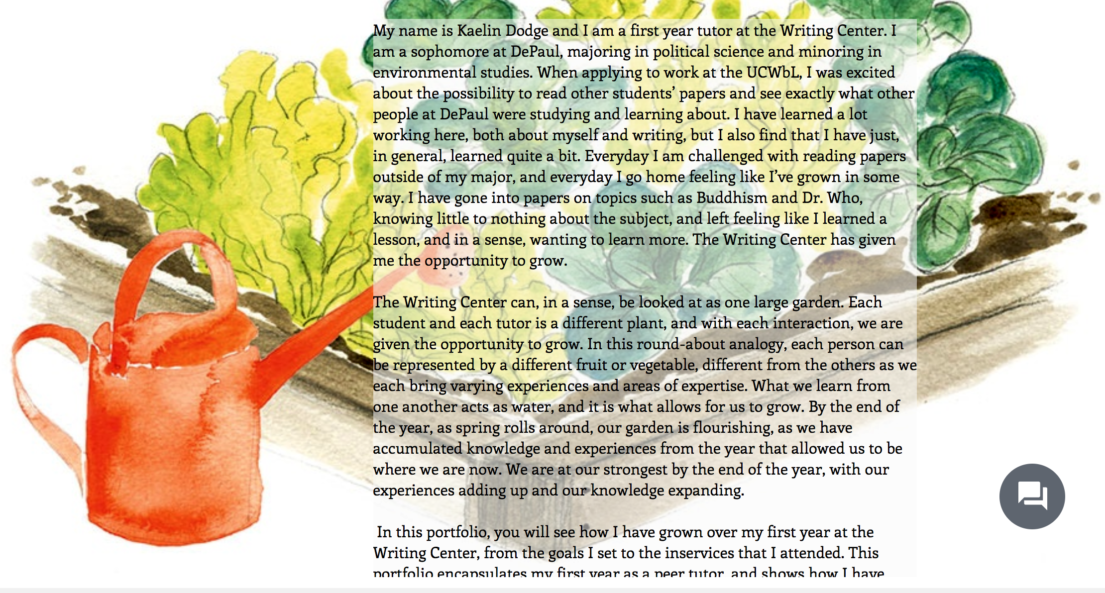
Compare the typography of the body text in the above (before editing) and below (after editing):
- We unjustified the body text in order to facilitate readability.
- We unindented the first sentence of each paragraph — indenting that first sentence is a writing for print convention — and added white space between paragraphs, which is a digital writing convention. Both are rhetorically conscious choices.
- Note how the left-justified text rubs right up against the text-box frame; that can be adjusted via “padding,” under Settings gear > Font paintbrush > Padding +/-
Possible Classroom Use?
If you have ever been in a Creative Writing workshop, you might recall a convention of focusing on one writer’s work, while she sits there, not participating, but listening, while workshop participants try to reverse engineer her work, and to identify her intended rhetorical effects.
This could make for a productive in-class digital writing portfolio workshop activity, if you have a student willing to volunteer her work.
Winter Quarter 2018 Plans
This mini-case study focuses only on Kaelin’s introductory Home Page. After we collect Autumn Quarter digital writing portfolios, we’ll identify a few that we can use for more detailed & generative reverse engineering and rhetorical justification analyses. The result could be productive for both students and faculty.
We’ll also invite students in for a Student Digital Writing Portfolio Roundtable discussion, feed them sugary treats, pepper them with questions, and connect even more dots!