These brief reflections were collected during the 2010 winter quarter for future WRD students. Previous students and portfolio designers were asked to describe,
- The portfolio design platform they chose, and why
- What went well in collecting, selecting, reflecting, and designing
- What did not go well, and what they might do differently next time
- Any advice that they want to share with you
We hope these insights and reflections from previous students help you imagine, plan, and implement your own WRD e-portfolio.
 For my WRD portfolio I decided to choose Adobe Acrobat Pro because I liked the polished look of PDF’s.
 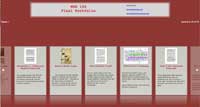 Collecting all the information to put in my portfolio was easy because I already had it organized on my own WordPress blog. Reflecting was not too bad once I had chosen which direction to base my reflection on. From there it was stating my points and then backing them up with evidence. The designing process has been the most difficult process. I’ve never used Adobe’s portfolio component and just opened it up for the first time and started working. I was frustrated that it didn’t allow me to reorder my work, but I was warned of this prior to starting. (You just have to name your files alphabetically in the order you want, or number them that way.) My recommendation to future students is to start this project ahead of time, and keep an open mind as to what platform you want to use.
 The platform I used was WordPress, because it is simple to use. I divided my cover letter, essay, and my other papers into “Pages.” The pages are in the upper-right hand side of the screen. For my Cover Letter I just added a post and it appears first, because that’s what readers will need to see first. This way everything is in one place and the portfolio is not one huge paper. The technology worked well overall. No difficulties. My advice is if you have a MAC you should use iWeb. For PC’s, you can use Acrobat if you want to be creative. If you want it to be simple and straight forward like me them I would recommend WordPress.
 I decided to use the Acrobat platform because I personally enjoyed the layout. I thought it was very easy to use, and
 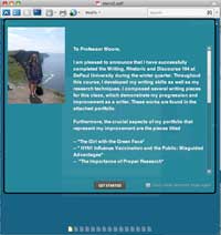 it looked quite professional. When reflecting on what I had learned this past quarter, I focused on becoming my own filter for information. Consequently, I considered all of the major pieces that I had composed throughout this course and compared my research techniques from the first assignment to the last. And since I knew that my research skills improved as the course went on, I designed my portfolio this way to demonstrate how my writing improved as time passed. As for technology, I thought it was easiest to produce my piece in Microsoft Word and then copy and paste the document into the WordPress post. Furthermore, I think this helped when I put together my final portfolio because I did not have to make any changes to my works if I had only written it on WordPress. Regardless, seize this opportunity to explore different platforms for producing your work because as we have seen, technology is becoming increasingly more important. Thus, it is beneficial to learn how to master these different techniques. Good luck! — Amy
 For my final portfolio, I chose to use iWeb because I have a Mac and thought that it would make the most sense to take advantage of the free program. When choosing which theme to use, I thought about how I wanted others to view my portfolio. I chose a clean and simple theme to display all of my work. I did not want my viewers to be confused as to where to find certain things and get lost in my portfolio. One thing I would change in my overall process is to plan ahead better. I would highly recommend writing out a simple outline beforehand, so that you know exactly how you want to go about making your portfolio, and do not waste time continuously changing things.
 I chose to use iWeb for my portfolio. I’m obsessed with my MAC and have wanted to use this application for something for awhile. It was really easy to use even
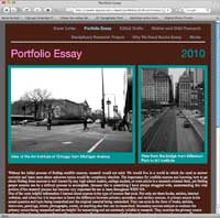 though I had no idea how to work it. It is meant to be easy to figure out for people who don’t have experience with that type of stuff, so it was really helpful in that sense. I also started working on my portfolio about halfway through the quarter. I just spent a few minutes each week adding things as I went along in the course which really helped to lighten my load as it got closer to finals. The only thing I had trouble with was copying and pasting from Microsoft Word, because it messes up the spacing. You have to paste it into a text editor first and then into iWeb for the spacing to be easier to read. Hope this helps! — Christina
 I have opted for a simple HTML webpage for my final portfolio simply by default. In an effort to clear space on my computer I have removed iWeb (and adobe doesn’t offer a trial for Macintosh). So I am compiling a website. As far as advice, the best thing to do is just to keep up. If you come out with a pretty reasonable final draft after each paper during the quarter, and keep up with the editing, you’ve already finished most of the the portfolio. Then it doesn’t feel intimidating and is not a big deal.
 For the portfolio, I used the platform iWeb. I have never used this application before but always wanted to try it. Last quarter, I saw some other students’ portfolios using iWeb and they turned out great. It was pretty easy to use for a first timer. One thing that I like about this application is that I don’t need to convert to any other format in order to publish it. I can say that “I’m a PC” since I have been using Windows for most of my life, but things must be in a specific format in order for it to work on a PC (trust me: I have spent hours figuring out why I couldn’t publish a video). iWeb is great and it looks nice as well as professional.
 For the final portfolio project I chose to
 do it through WordPress. I chose this versus the other two — iWeb or Acrobat — because I do not have a MAC, and I didn’t feel like downloading the Acrobat version. Although I am horrible with technology, I also felt that this would be the best and easiest way for me. I enjoyed WRD because everything is so different compared to other classes. It’s a good thing! Always keeps you thinking. You’ll see!
 The platform that I selected for my portfolio was iWeb. I had never really used this program before; I actually did not know that I had it in my computer until I searched for it. I think that overall this platform is easy to use even for someone like me, who is horrible with technology. I really liked iWeb because there were many different templates to choose from. For the portfolio, I would recommend that people use the Blog format because it
 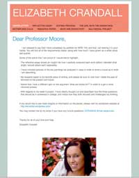 automatically creates an archives page, which is like a Table of Contents and it makes the Portfolio seem more organized and professional. I did have one major problem with iWeb that frustrated me. I would drag-and-drop images into my Reflection Essay — such as peer-edit comments, for example — and when I would publish the site, the images would not be in the same position that I had placed them in. This was a problem that I was eventually able to overcome by removing the hard returns I had inserted to make room for the images. (It turned out that you shouldn’t drag and drop but, rather, Insert > Image.) I would also recommend playing around with the different template themes. I originally started out with one theme, then I decided to change it as my portfolio progressed. Pick a template that is easy to read and that is simple, and a template that fits your writing or personality. Finally, I would like to encourage you to not be scared to use this program if you have never used it before because if you only give yourself about 15 minutes to just play around with it, you will also find out that it is a nice program to use to display all of the work you have done throughout the quarter.
 The platform that I selected for my final portfolio was WordPress. I decided to use WordPress because it is very easy to use and
  because we used it consistently throughout the entire ten weeks of Winter Quarter. WordPress is not only easy to use but also has professional “themes”–or layouts–that can add an interesting yet professional aspect to the appearance of the blog. For the final portfolio, I made all of the major writing projects into “pages” that can be accessed at the top of my blog. The pages allowed for an easy and organized method for viewing the writing projects. Overall, I was very pleased with the WordPress option. I had absolutely no problems with the medium and would recommend WordPress not only for blogging but for an academic portfolio.
 I chose iWeb, and writing a portfolio is not as daunting a task as many believe. Though generally they account for the majority of one’s grade, it does not account for a majority of the work. When I sat down to write my portfolio, the only thing that I struggled with was remembering the genre. After I figured that out, I wrote about 2,000 words in 4 hours. I was able to do this because I focused on what I learned this quarter and related that to my writing process for each of the exhibited essays. After identifying what I learned, I found it much easier to develop my ideas and show what I learned and how I utilized that information. The most confusing part of my portfolio was the presentation of the information. Then I realized that I shouldn’t get caught up in aesthetics so long as the it doesn’t look lazy and thrown together.
 For my WRD portfolio, I used Adobe Acrobat Pro because it looked professional and user friendly. It was very easy to collect my papers and place them into Adobe Acrobat Pro. My suggestion would be to
  alphabetically name your documents before placing them into Acrobat Pro because they appear alphabetically. I am not the most technologically savvy person and using Acrobat Pro was simple. It is a great program and allows your portfolio to look professional and neat! I recommend that students start the portfolio project ahead of time, because it will allow them more time to add interesting elements, pictures, etc to the portfolio and remember to proofread! Good luck!
