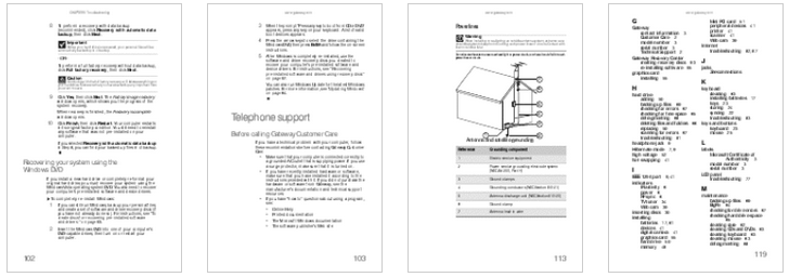
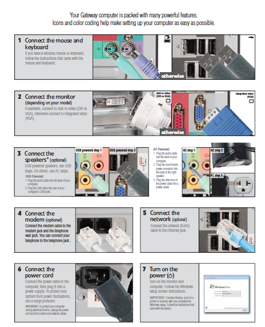
Today we’ll discuss a theory and pedagogy behind minimizing the amount of assignment and explanatory text that we give to students. It draws on John Carroll’s work in the 1990’s on minimalism and technical communication. He revolutionized computer documentation — for example, if you bought a Gateway computer in the early 1990’s, it came with a multi-page “set-up guide” that nobody could read. Post-Carroll, when you opened your new Gateway, it only had a fold-out poster with several contextual visuals and about 20 words on it. Apple took it from there; if you’re familiar with their packaging and documentation, it’s pretty minimal.
Adapting some of Carroll’s principles, I have replaced “users” with “students”:
- Use authentic tasks and materials for the course and encourage students to select their own audience-based projects. This approach enables students to use their prerequisite knowledge, competence, and engages a powerful source of motivation.
- Get students started on authentic tasks and processes fast by eliminating almost all front-end orientational material. Extensive preambles can obstruct meaningful activity.
- Guide students’ reasoning, exploring, and improvising with questions and other hints.
- Design course materials so that they can be read in any order in so far as possible. This principle permits learners to “support their own goal-directed activities.” Use “high degree of modularity” and “small, self-contained units.”
- Help students to coordinate course materials by providing landmarks for normal or conflicted situations.
- Aim for optimizing learning designs by repeated testing and avoiding the temptation to systematize approaches into checklists.
Howard Clauser has generously agreed to share some of his before-and-after examples.
Carroll before-and-after examples:


