
Some quick notes from last Friday’s typography session:
Joyce Bean, Krissy Wilson, Erin MacKenna-Sandhir and I had a good, productive, generative conversation about the role of typography in the writing classroom.
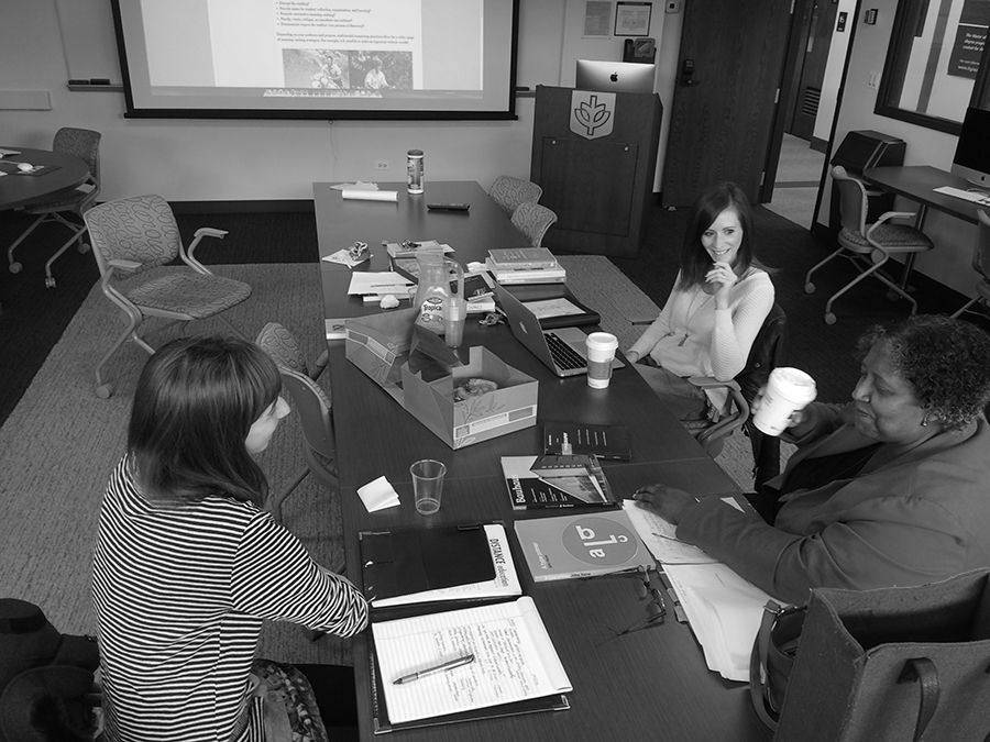
We talked about Diana George’s “From Analysis to Design: Visual Communication in the Teaching of Writing,” which argues for a more rhetorically informed use of images and design than (as she perceives it) the visual as merely attendant to the verbal and textual. We briefly summarized John Trimbur’s “Delivering the Message: Typography and the Materiality of Writing”: “…one of the main obstacles to seeing the materiality of writing has been the essayist tradition and its notion of a transparent text.”
I also recommended Robin Kinross’s “The Rhetoric of Neutrality,” in which he does a rhetorical analysis of railway timetables, showing that they really aren’t all that neutral (attached as a PDF).
We looked at the ways in which we try to prepare students to compose with typographic sensitivity in general and text + images, in particular — https://depaul.digication.com/fyw/Digital_Presentation_Formatting — noting some disciplinary differences along the way, especially in relation to technical communication and composition.
Erin showed us a great John Oliver segment on “Migrants and Refugees” — https://www.youtube.com/watch?v=umqvYhb3wf4 — in which Oliver does a great rhetorical analysis of news coverage, basing much of it on typographic examples.
Krissy shared the rhetorically compelling “I’M COMIC SANS, ASSHOLE” — http://www.mcsweeneys.net/articles/im-comic-sans-asshole — which Joyce pointed out complements the film Helvetica nicely!: http://www.hustwit.com/category/helvetica/
We talked about scrapbooks as multimodal processes and products and how they can be used in writing classrooms, as well, especially as archive projects. Kathleen Yancey writes about scrapbooks in “Notes Toward the Role of Materiality in Composing, Reviewing, and Assessing Multimodal Texts” (Computers & Composition 31, March 2014, Pages 13–28), but we also noted how typographically rich scrapbooks can be — again, both in process and product.
We talked about Ellen Lupton’s excellent work —http://www.thinkingwithtype.com/ and discussed some of her slides on book design — http://www.thinkingwithtype.com/misc/Beautiful_Books.pdf — noting some of the typographic conventions that we use with students on layout, document design and rhetorical strategies such as contrast, repetition, alignment, and proximity: https://depaul.digication.com/fyw/Digital_Presentation_Formatting.
And our colleague Eric Plattner’s project, Poems While you Wait — http://poemswhileyouwait.tumblr.com/ — models poesis in many manifestations, there’s also such an interesting typographic feature to the work, too.
It was good! We’re going to schedule another session in the future where we can look at Lynda.com more closely together, focusing on typographic design videos and exercises files.
Next up, suggested by Tricia Hermes:
- Friday, November 6th: What are the implications of hyperlinks to sources integrated in students’ research papers in lieu of in-text & parenthetical citations?
I think the best background and context for this session might be the MLA Style section in our SMH and Robert Connor’s “The Rhetoric of Citation Systems
Part II Competing Epistemic Values in Citation,” attached.
“Today, citation styles are important to the self-definition of many disciplines, and their forms reflect serious choices for writers and publishers. Indeed, the ideology of citation practices and styles is hotly debated. We suggest that student writers think about the implications of citation styles, what they foreground, and what they erase.” (Lunsford, TWLH 160).
Thanks for reading!