
Some initial differences in print vs. digital writing & editing
- We don’t indent initial sentences in paragraphs — that’s a print & academic convention
- We do add white space between paragraphs

- Line/sentence lengths should average 8-12 words per line for readability — longer than that, and the reader gets visual/cognitive fatigue and overload, rendering your hard work unreadable
- We often use serif fonts — such as Georgia — in body text for readability
- We provide well designed and managed hyperlinks, since that is what the internet & WWW were designed for, and every link is a promise.
- Good links have a few characteristics: a color contrast from surrounding body text of at least 3:1 — the convention is blue — underlined, and the writer has made a conscious decision to open in a new tab, or to open in the same tab.
- Don’t justify text; keep it aligned left, or what some people call “left justified”
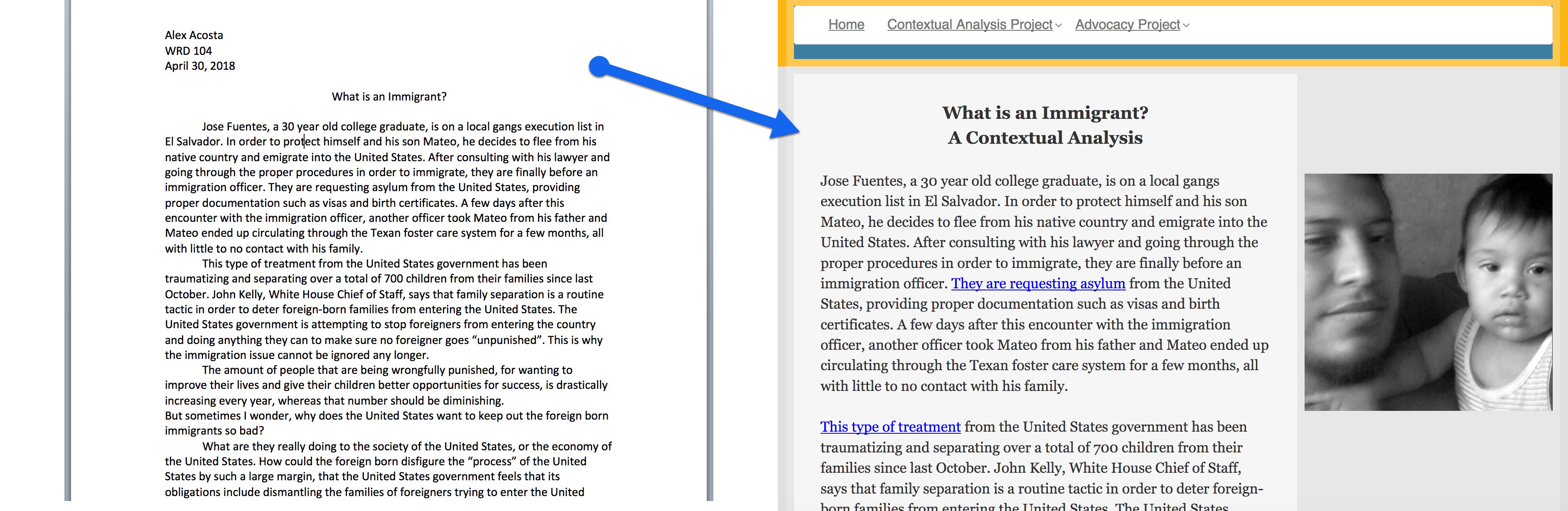
- For the purposes of this typographic treatment, add images that help to break up the text and help to illustrate a point in your narrative — i.e., not just a decorative image. Your own images are usually going to be more compelling than stock photos.