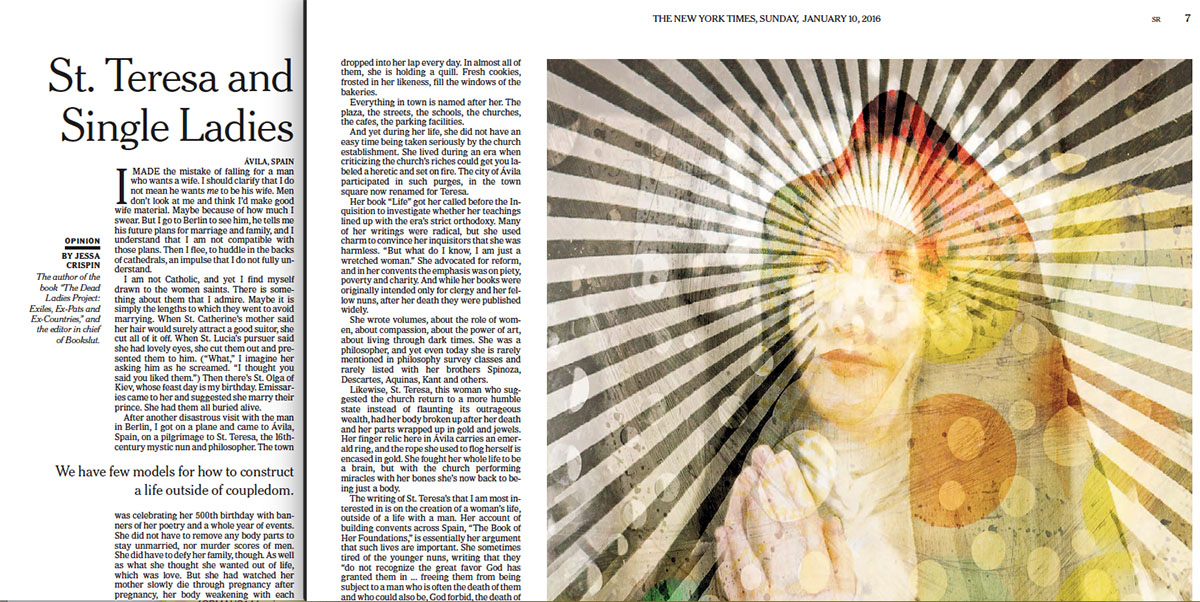
Typographically speaking, it’s interesting to see how the NYT arranges and organizes text & images in print and in digital formats. Here are pages 7-8 from today’s Sunday Review, via PDFs, which is already a substantial shift from the printed page:
- Here’s the online version, for comparison
- And compare on your phone
- St. Teresa illustration by Vivienne Flesher
- The New York Times Article Redesign (May, 2013)

