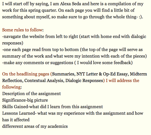
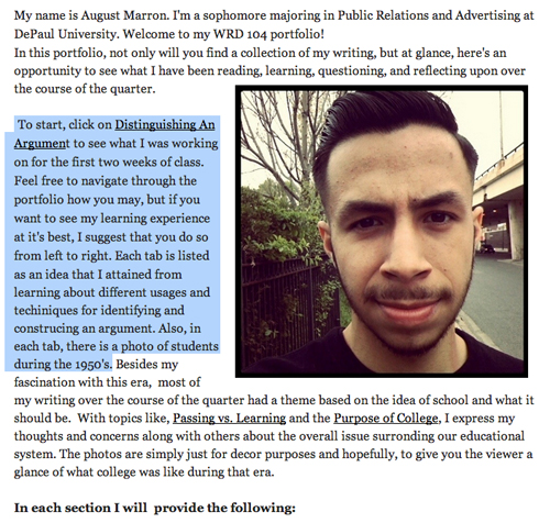
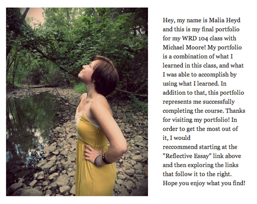
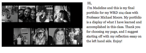
Some common audience-based editing considerations for the first, introductory page of your portfolio, based on these assumptions:
- Your readers will likely judge you and how seriously to take you based on the immediate rhetorical effect of your portfolio’s main, introductory page
- You want to be taken seriously
- Readers need guidance
Decisions about your banner
Compelling arguments can be made about the rhetorical appropriateness of the default DePaul banner that comes with your portfolio’s template. Read more about DePaul’s “Tree of Wisdom.”
If you do not want to keep the default DePaul banner, you should create your own with your own photograph or illustration. Avoid what have become visual clichés: Chicago Cubs logos, pictures of the Bean, photos of the Chicago skyline. These examples might not (yet) be visual clichés to you, but they increasingly are to people who read 300-400 DePaul portfolios a year. We can talk more in class about the rhetoric of visual clichés; it’s an interesting topic.
My advice: make the visual design and rhetoric of your portfolio about you: you as a writer; you as a student; you as a professional; you as a creative person.
Providing a coherent organizing principle for readers
The introductory section of your portfolio serves a few rhetorical purposes:
- It announces your successful completion of our course
- It describes what is in your portfolio, and why
- It provides a roadmap for reading your portfolio
Your readers may or may not know you; they may or may not already be familiar with your work. This is an important audience-based consideration to keep in mind. No matter who they are, they will need some guidance about how to read your portfolio: where to start, what to focus on, and what you’d like to highlight. Readers can become alienated quickly when left on their own with no guidance.
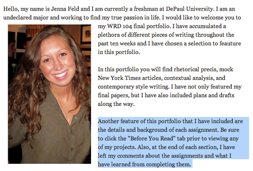
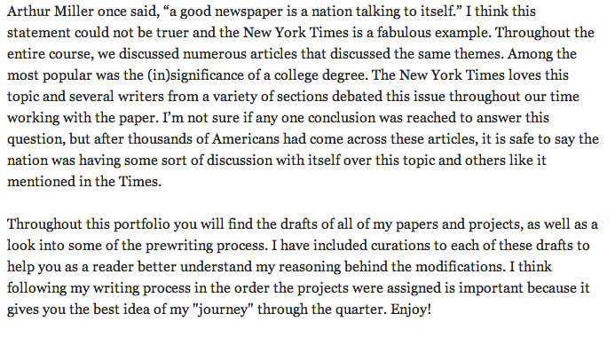
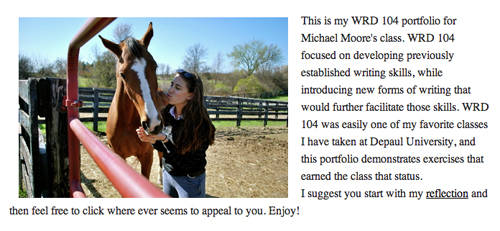
We can discuss these examples — note especially the text-and-image horizontal alignment:


